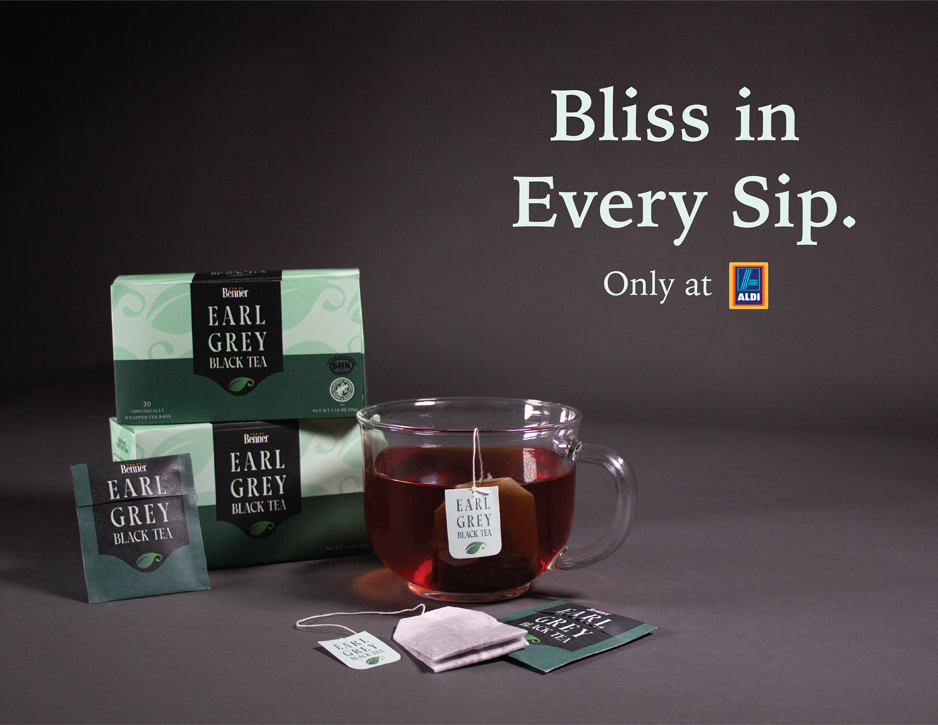
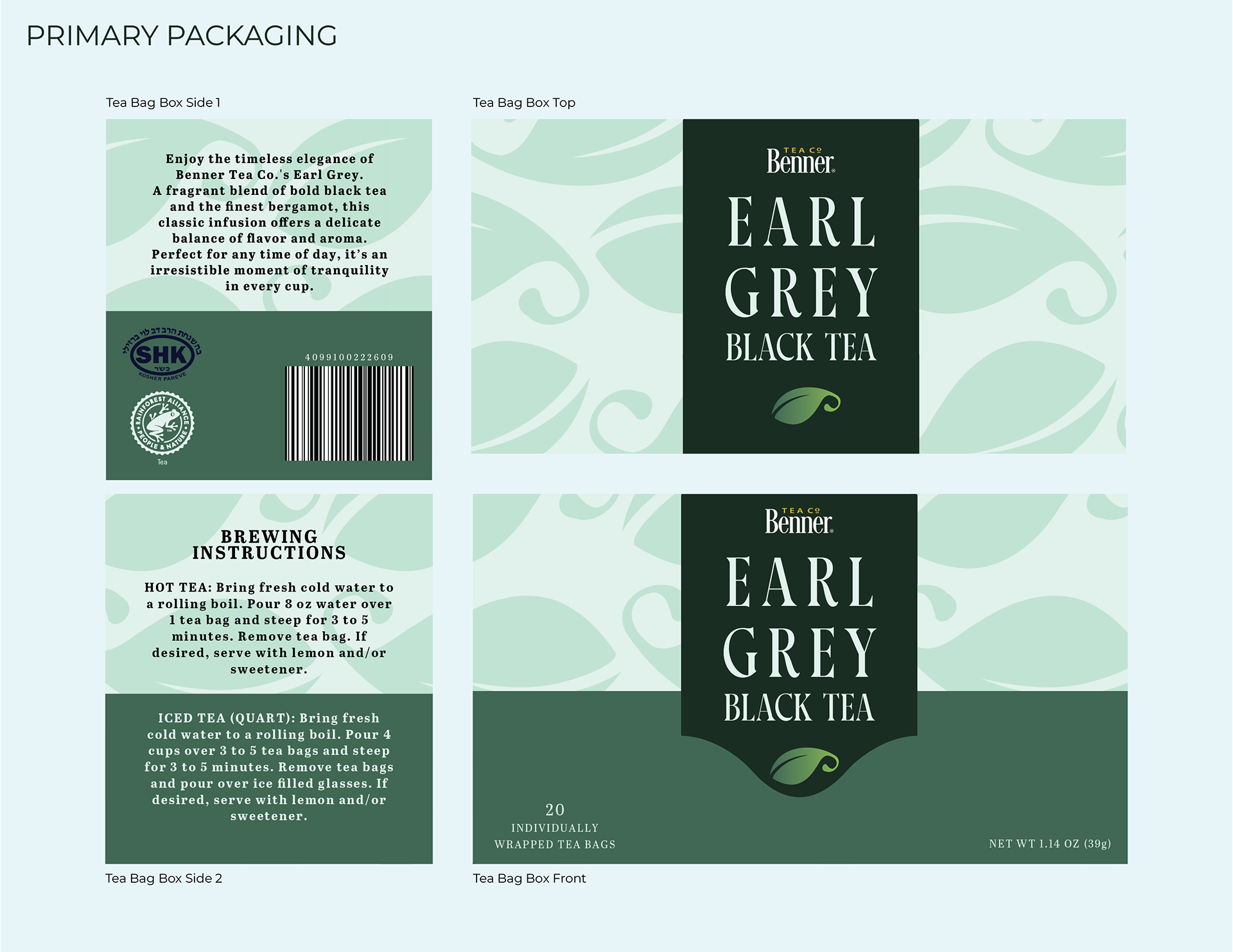
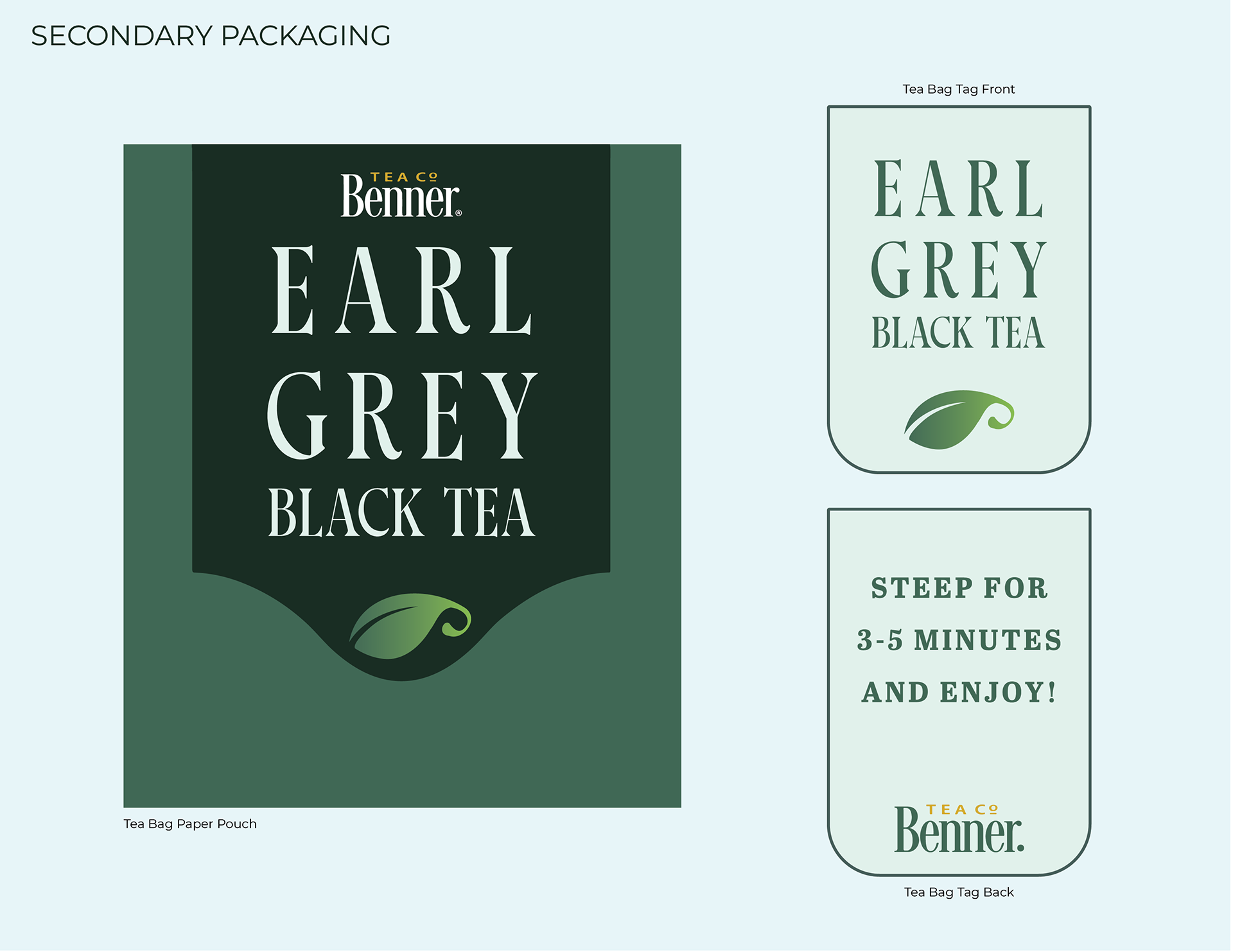
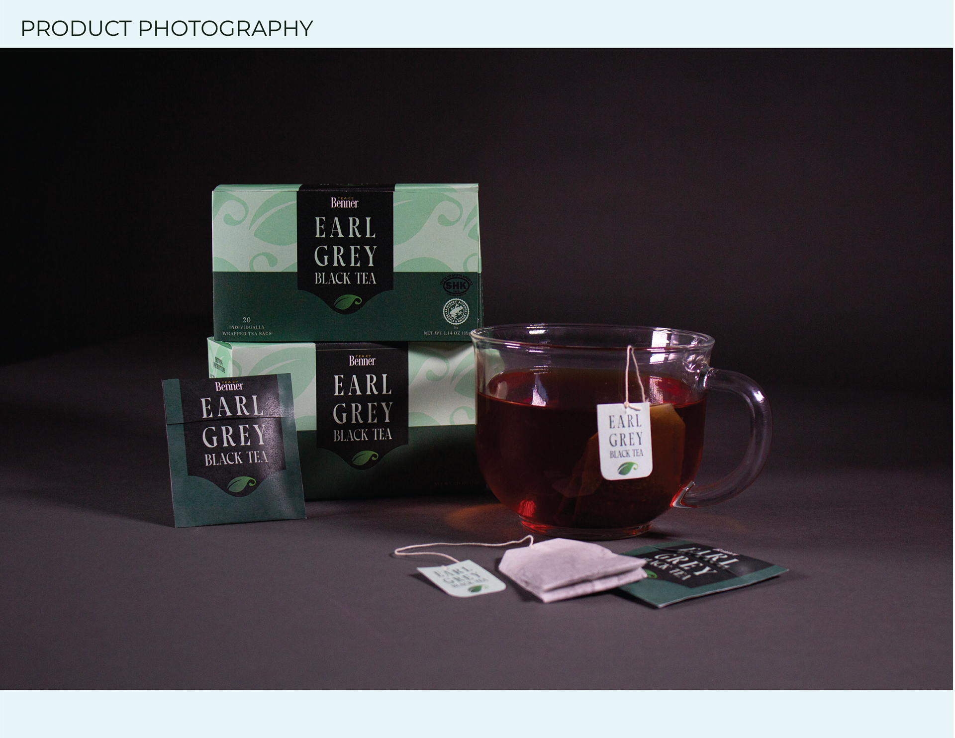
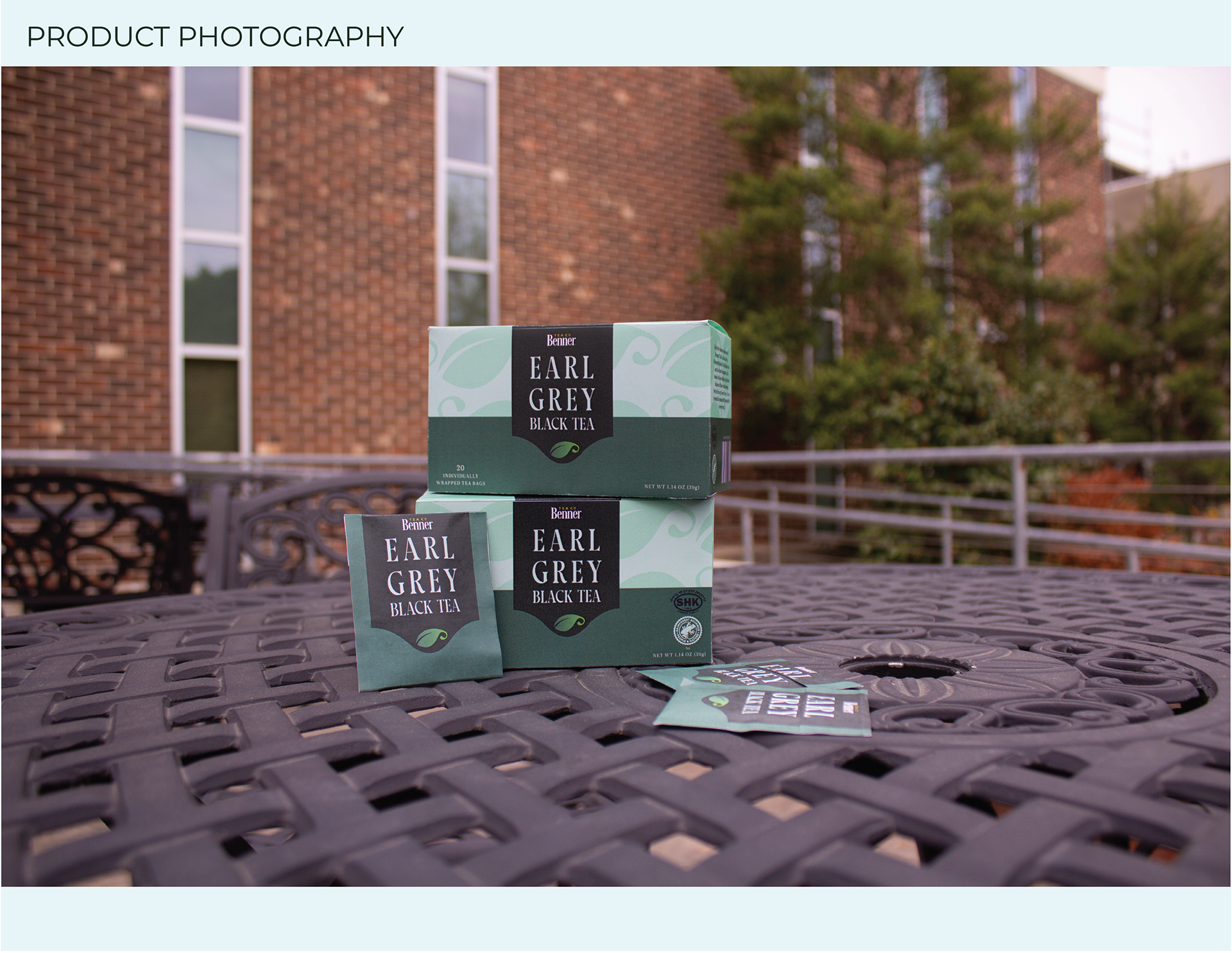
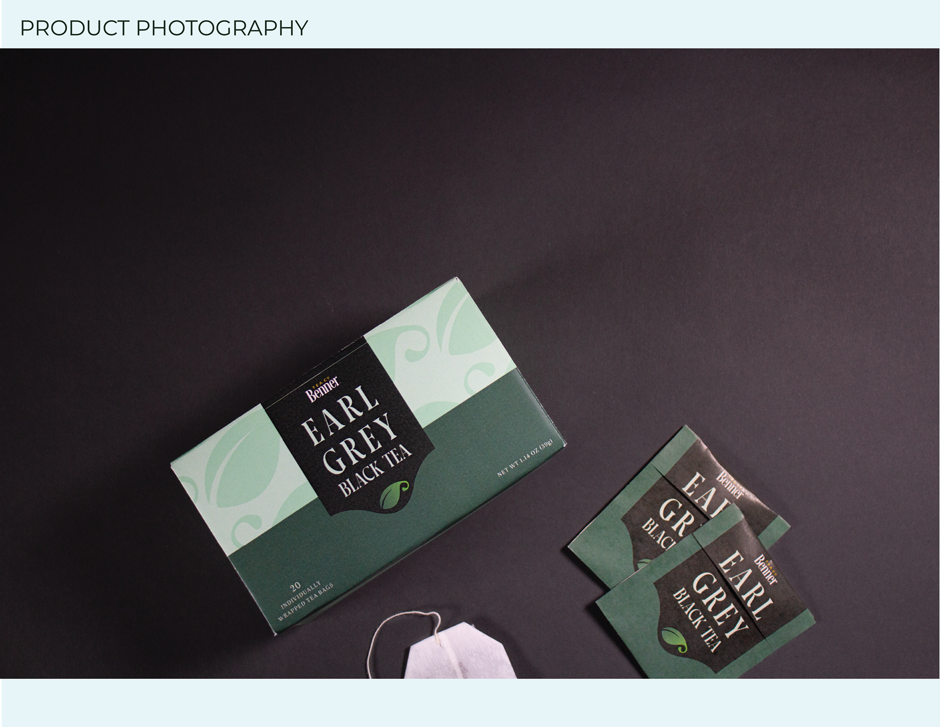
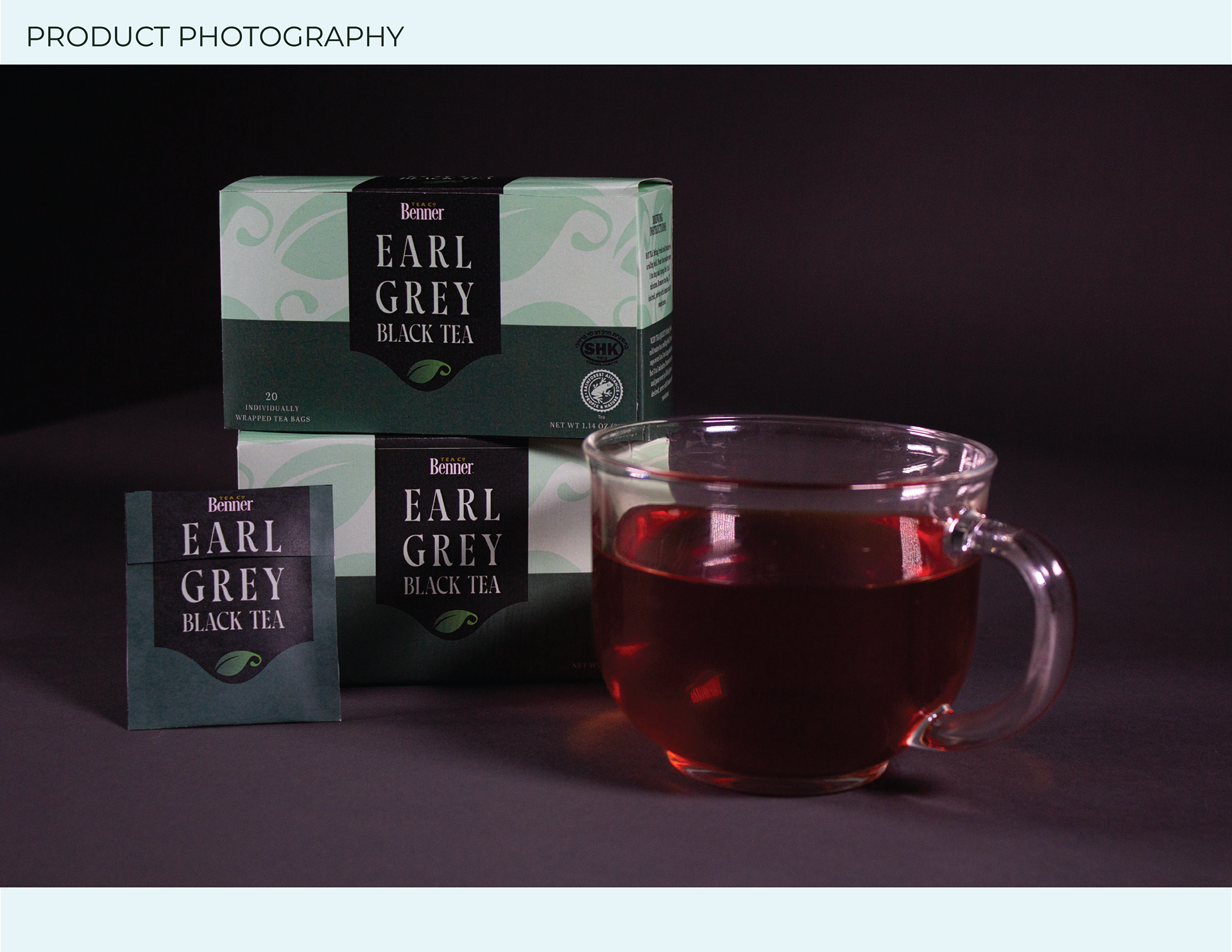
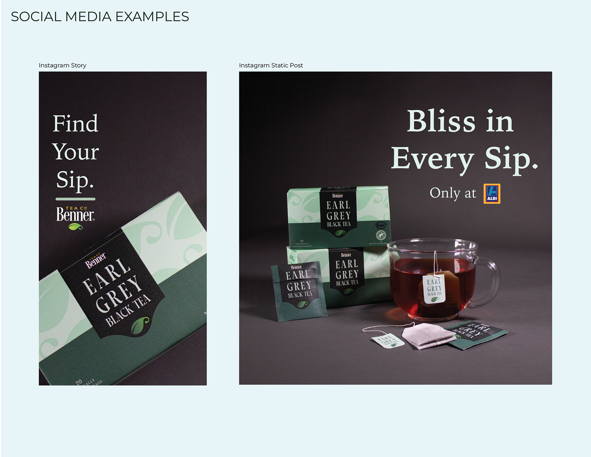
My concept client, Benner Tea Co., needed a refreshed packaging design for their main line of teas. I started with one of their most popular varieties (Earl Grey) to establish the new visual identity, with plans to redesign other tea flavors after that point. Since Benner Tea Co. is an in-house brand at Aldi stores, I wanted to create something that wouldn't look out of place but would stand out in a positive way. The majority of their target audience are pre-existing shoppers at their stores, who may have passed the product by one the shelves due to uninteresting packaging. I started my design process by looking at major tea brands with iconic packaging, and narrowed down what makes them stand out from the crowd.
I settled on using type and color to create a design that feels more sophisticated and on-par with heritage name brands. The original green in the Benner Tea logo inspired the various greens that make up the color palette. For the type, I chose a serif font that was easy to read while still maintaining a decorative flair.